DATE OF THIS ** ORIGINAL ** COVER: 1907 The Quaker Oats logo starting in 1877 had a figure of a Quaker man depicted full-length, sometimes holding a scroll with the word "Pure" written across it, resembling the classic woodcuts of William Penn, the 17th-century philosopher and early Quaker.[25] Quaker Oats advertising dating back to 1909 did, indeed, identify the "Quaker man" as William Penn, and referred to him as "standard bearer of the Quakers and of Quaker Oats."[26] In 1946, graphic designer Jim Nash created a black-and-white head-and-shoulders portrait of the smiling Quaker Man, and Haddon Sundblom's now-familiar color head-and-shoulders portrait (using fellow Coca-Cola artist Harold W. McCauley as the model) debuted in 1957. The monochromatic 1969 Quaker Oats Company logo, modeled after the Sundblom illustration, was created by Saul Bass, a graphic designer known for his motion picture title sequences and corporate logos. In 2012, the company enlisted the firm of Hornall Anderson to give the 'Quaker man' a slimmer, somewhat younger look.[27][28] The man is now sometimes referred to as "Larry" by insiders at Quaker Oats.[29] And in 1965, a new advertising slogan was introduced: "Nothing is better for thee, than me". The company states that their current 'Quaker man' logo "does not represent an actual person. His image is that of a man dressed in Quaker garb, chosen because the Quaker faith projected the values of honesty, integrity, purity and strength."[30] The company has never had any ties with the Religious Society of Friends (Quakers). When the company was being built up, Quaker businessmen were known for their honesty (truth is often considered a Quaker testimony). The Straight Dope writes "According to the good folks at Quaker Oats, the Quaker Man was America's first registered trademark for a breakfast cereal, his registration taking place on September 4th, 1877." [31] Members of the Religious Society of Friends have occasionally expressed frustration at being confused with the Quaker Oats representation.[32][33] In recent years, Friends have twice protested the Quaker name being used for advertising campaigns seen as promoting violence. In 1990, some Quakers started a letter-writing campaign after a Quaker Oats advertisement depicted Popeye as a "Quakerman" who used violence against aliens, sharks, and Bluto.[34] Later that decade, more letters were sparked by Power Rangers toys included in Cap'n Crunch cereal.[35] Sundblom was born in Muskegon, Michigan, to a Swedish-speaking family. His father, Karl Wilhelm Sundblom, came from the farm Norrgårds in the village of Sonnboda in Föglö, Åland Islands, then part of the Russian Grand Duchy of Finland now Finland, and his mother Karin Andersson was from Sweden. Sundblom studied at the American Academy of Art. Sundblom is best remembered for his advertising work, specifically the Santa Claus advertisement. It was he who drew Santa Claus in a red suit during the twenties when he painted for The Coca-Cola Company, starting in 1931.[1][2] Sundblom's Claus firmly established the larger-than-life, grandfatherly Claus as a key figure in American Christmas imagery. So popular were Sundblom's images of Claus (Sundblom's images are used by Coca-Cola to this day) that Sundblom is often credited as having created the modern image of Santa Claus.[3] According to the Coca-Cola company:[4][5] "For inspiration, Sundblom turned to Clement Clarke Moore's 1822 poem "A Visit From St. Nicholas" (commonly called "'Twas the Night Before Christmas"). Moore's description of St. Nick led to an image of Santa that was warm, friendly, pleasantly plump and human. For the next 33 years, Sundblom painted portraits of Santa that helped to create the modern image of Santa – an interpretation that today lives on in the minds of people of all ages, all over the world." In 1942 Sundblom also created Coke's mascot Sprite Boy, who appeared in print ads during the 1940s and 1950s.[6] Sundblom is recognized as a major influence on many well known pin-up artists, such as Harold W. McCauley, Gil Elvgren, Edward Runci, Joyce Ballantyne, Art Frahm, and Harry Ekman. In the mid-1930s, he began to paint pin-ups and glamour pieces for calendars. Sundblom's last assignment, in 1972, was a cover painting for Playboy's Christmas issue which included a short bio with his photo. "Sundblom gets pigeonholed as the painter of Coca-Cola Santa Clauses, but this trivializes his central place in 20th century advertising art. More than any artist including Norman Rockwell, Sundblom defined the American Dream in pictures, proved by his work for virtually the entire Fortune 500. [Among his still-living legacy is the Quaker Oats man, posed by his friend and colleague, Harold W. McCauley.]"[7]
Item Condition: SEE PHOTO CAREFULLY...All original ads have some sign of age use.. these are period ads and we take quality photo's to show any flaws. If you have questions about condition please ask... We do not reveal the periodical from which the ad is removed ... except to the buyer ! Please don't ask us email this info... or higher res. photo's.... For those folks who wish to copy and print our photo's be aware they are photo copyrighted. and we will report misuse ! We DO try and note and MAJOR flaws....otherwise please use the photo as part of the description...
DESCRIPTION OF ITEM: AN ORIGINAL ILLUSTRATED COVER (COVER ONLY) FROM VINTAGE PERIODICAL...COVER IS BEING SOLD AS-IS WITH ALL FAULTS AS SEEN IN PHOTO(S)
DATE OF ORIGINAL COVER: SEE TITLE
SPECIAL CHARACTERISTICS/DESCRIPTIVE WORDS:
The Quaker man logo versus Quakers[edit]
ILLUSTRATOR/ARTIST:
Haddon Sundblom was the creator of Aunt Jemima, the Quaker Oats man, Coca-Cola's Santa and International Harvester's beloved Irma Harding. Find out more about the story here.
Haddon Hubbard "Sunny" Sundblom (June 22, 1899 – March 10, 1976) was an American artist of Finnish and Swedish descent and best known for the images of Santa Claus he created for The Coca-Cola Company. He used his own image for the famous Santa.
Background[edit]
Career[edit]
IMAGE SIZE: SEE PHOTO FOR DIMENSIONS ( ALL DIMENSIONS IN INCHES)
**For multiple purchases please wait for our combined invoice. Shipping discount are ONLY available with this method. Thank You.
.jpg)

THE COLLECTING OF MAGAZINE COVER ART IS INTRIGUING IN THE SENSE OF "THE FIND" AND ALSO "THE BRAG" ... BEING IN EVERY SENSE OF THE WORD-EPHEMERAL, MOST MAGAZINES WERE NOT INTENDED FOR LONG-TERM SURVIVAL. STARTING WITH THE FIRST MAGAZINE (IE: THE GENTLEMAN'S MAGAZINE, FIRST PUBLISHED IN 1731, IN LONDON, CONSIDERED TO HAVE BEEN THE FIRST GENERAL INTEREST MAGAZINE). MOST WERE READ, AND RE-READ AS THEY WERE PASSED ALONG BUT EVENTUALLY MOST WOULD END UP IN THE TRASH OR THE SCRAP PAPER-BUYER'S CART...AND SO THE ENJOYMENT OF COLLECTING MAGAZINES AND THEIR SUPERLATIVE COVER ART BEGAN.
WARS, HATE MONGERS, BOOK BINDERS, SCRAP DRIVES, RODENTS, MOLD AND FIRE, HAVE TAKEN THEIR TOLL UPON SURVIVAL...ALONG WITH FLOODS, TORNADOS, AND OTHER NATURAL DISASTERS WHICH CONTINUALLY REDUCE THE AVAILABLE NUMBER OF COLLECTIBLE COVERS TO ENJOY, PURCHASE, AND SHOW OFF.
AS WITH ALL EPHEMERA, CONDITION, SCARCITY, CONDITION, DESIRABILITY, CONDITION, AND ... DID I MENTION...CONDITION...ARE THE PRIME FACTORS INVOLVED IN PRICE.
PERFECT COVER ART IS RARE---AND PRICED ACCORDINGLY!
MOST COVERS PRIOR TO 1880 WERE PRINTED ON ACID FREE PAPER...AFTER THAT PAPER QUALITY CONTINUES TO DECLINE.
IT IS ALWAYS BEST TO USE ACID-FREE STORAGE IN MOUNTING PRACTICES IN COLLECTING MAGAZINE COVERS
AS DECORATIVE ART, THESE COVERS GIVE YOU, THE BUYER, AN OPPORTUNITY TO PURCHASE AND ENJOY FINE GRAPHICS.
As graphic collectors ourselves, we take great pride in doing the best job we can to preserve and extend the wonderful historic graphics of the past.
PLEASE LOOK AT OUR PHOTO CLOSELY AS IT IS (ALBEIT LOWER RESOLUTION) THE PRODUCT BEING SOLD.....NOT STOCK IMAGES
**NOTE** : PAGES MAY SHOW AGE WEAR AND IMPERFECTIONS TO MARGINS, WITH CLOSED NICKS AND CUTS, WHICH DO NOT AFFECT AD IMAGE OR TEXT WHEN MATTED AND FRAMED.
We ship via United States Postal Service. We have a 4 day handling time not including weekends or holidays but normally we have all orders processed, packed and shipped within 48 hrs.
A Note to our international buyers (Including Canada). Please read before placing a bid or buying an item:
**Import taxes, duties and charges are not included in the item price or shipping charges. These charges are the buyer's responsibility. Please check with your country's customs office to determine what these additional costs will be prior to bidding/buying on items. These charges are normally collected by the shipping company or when you pick the item up, this is not an additional shipping charge. We do not mark merchandise values below value or mark items as GIFTS, US and International government laws prohibit this so please don't ask us to. We are not responsible for shipping times to international buyer's. Your country's customs may hold the package for a month or more.We ask that payments be made within 2 days or notify us via email otherwise. We send out a reminder payment email once and then proceed with unpaid item report on the 4 th day.
**We pride ourselves on quality products, great service, accurate gradations and fast shipping.**
BRANCHWATER BOOKS GRADING SCALE:
GOOD-->VERY GOOD-->FINE

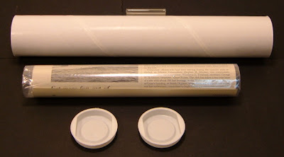
YOUR AD WILL BE SHIPPED ROLLED IN A PROTECTIVE PLASTIC BAG IN AN 80mm (TWICE USPS RECOMMENDED) THICK, 2 INCHES IN DIAMETER (SO AS NOT TO STRESS THE PAPER) SHIPPING TUBE WITH PRESS TIGHT PLASTIC END CAPS.
VG30


Powered by SixBit's eCommerce Solution